Facility: The Wall, Vista, CA
Futurist Services: Wall & Facility Design, Custom Flooring System
Open Since: June 2014
Website: www.thewallclimbinggym.com
Q: Why did you choose to engage Futurist Climbing Consultants as independent designers for your climbing gym?
A: After shopping around for wall designers we couldn’t find anyone that really took pride in their work. We received a handful of designs from different manufacturers that looked just like any other wall would, there was no creative input, nothing out of the ordinary. After our first conversation with Timy we knew he would provide us with something different. He asked us who we were, what our influences were and what we wanted our facility to feel like. Futurist was a clear choice for us.
Q: What inspired your climbing gym design (other gyms, art, architecture, rock, etc.)?
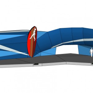
A: Both Matt and I are predominantly surfers and spend a good majority of our time in or around the ocean. After taking one look at our wall it’s quite obvious what it’s designed after: a wave. Timy and Ernest took the look and feel of one of the worlds most famous – and heaviest – waves and designed our wall after it.
Q: Which of your own gym’s design attributes are your favorite, and why?
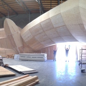
A: An easy choice: the massive, 7’ high roof that extends out to create a curving wave enveloping almost half of the climbing area. Our contractor can fit his F250 with a lumber rack under it and it looks small. No other gyms (at least any that I’ve seen) have anything this impressive.
Q: How would you seek to improve your climbing gym design?
A: After finally building the entire facility out it does seem like we have quite a bit of steep (very steep) terrain and much less vertical and slightly overhanging terrain. While this creates a very unique look and feel, it does limit the style of climbing and type of climber to a narrower window. If anything, I’d add in a bit of ‘easier’ terrain. Oh, and I also still want my 90 degree dihedral.
Q: Why didn’t you include a freestanding boulder in your gym design like many gyms?
A: A freestanding boulder may look cool from a layout perspective, but they kill your wall to pad ratio. We have right around a 1:1 ratio, meaning for every square foot of wall we have one square foot of pad. Including a freestanding boulder would have given us slightly more climbing terrain but increased our pad costs greatly.
Q: What is it about your climbing wall design that expresses your own personal passion for climbing?
A: Both Matt and I (especially Matt) are very dynamic, powerful climbers that like to get our blood pumping and our adrenaline flowing. Our overhanging, 18’ high top out does just that and offers plenty of room for big moves.
Q: How do you view your climbing wall design as an attribute to your brand?
A: Our brand and our climbing wall are one in the same, it is what people will come to see from all over So Cal. Our gym offers serious climbers a place where they can push their abilities to the limit, both on the wall and in our state of the art training facilities. Without our design, we would be just like any other gym.
Q: Which climbing wall supplier built your walls?
A: We built it ourselves (contractor in the family) with some design-build help from Timy and Ernest.
Q: What were the selection criteria for the climbing wall company that you ultimately contracted?
A: Good references, ability to think outside the box and cost.
Q: What were the most significance things that you learned during the process of designing your climbing gym?
A: Create something that is unique and will make people want to go out of their way to climb on. If people don’t have a good reason to travel further or even leave their current gym for a new one, they won’t. We wanted to stand out from the crowd, and we will.
Q: Please share any notable customer feedback that you have received regarding your climbing gym design.
A: Although we are not yet open we have received only great feedback. Probably the most common is ‘wow, that roof is massive!’
Q: From a design perspective, which other commercial climbing gyms are your favorites and why?
A: We are both big fans of LAB due to their variety of terrain, great layout and high climbs with great pads underneath. The curves and shapes they created are very appealing to the eye, even for non-climbers. The only downside to their facility is their wall texture, it feels like 40 grit sandpaper, leaving you with bloody knuckles and bloody knees more often than not.
Q: In your opinion, what are the most common design-related mistakes historically made by commercial climbing facilities?
A: Being too generic. Why open a gym that’s just like all the rest if you have the option to do something great?
Q: Any advice regarding the design process that you can offer aspiring climbing gym owners?
A: Offer a variety of terrain that can appeal to everyone. Remember, you’ll have everyone from V13 to VB climbers at some point and they all need to find a number of problems on differing terrain. Also, don’t be generic!
Q: How important do you think it is for a modern era climbing gym owner-operator to be actively practicing the sport of climbing?
A: Very – being able to relate to your customers is one of the greatest marketing tools you have.
Q: From an idealistic standpoint, what would be the ultimate super-charged dream climbing gym design concept of the future?
A: Our wall, only expanded to 10x it’s current size, and with a bit less extreme overhangs and way more dihedrals.


