Facility: Focus Climbing Center, Mesa, AZ
Futurist Services: Business Consulting, Wall & Facility Design, Custom Flooring System
Open Since: June 2013
Website: www.focusclimbingcenter.com
Q: Why did you choose to engage Futurist Climbing Consultants as independent designers for your climbing gym?
A: The guys at Futurist are not concerned with how much money the wall company can make off of you. They are concerned with making a bad-ass unique design that fits your demographic—not a cookie cutter gym full of top ropes and intersecting fall zones in your bouldering area. In my opinion, gyms that are “climber’s gyms” are always a better experience. Futurist is a climbers company – they are not out to make a quick buck. They want to provide you with the best gym possible, not a design they made last month in a different city.
Q: What inspired your climbing gym design (other gyms, art, architecture, rock, etc.)?
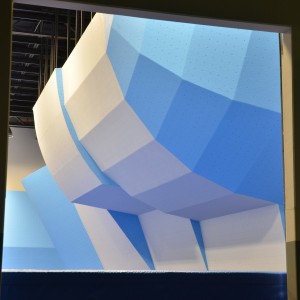
A: My years of route-setting for the Asian X-Games and other high end comps. Also, I wanted a design that fostered climb-ability, and provided popular angles similar to the USAC Nationals wall and other IFSC World Cup bouldering events. Also, I am so tired of earth tone or rock looking walls. This is indoor climbing, if you want to climb on something that looks like rock – go outside.
Q: Which of your own gym’s design attributes are your favorite and why?
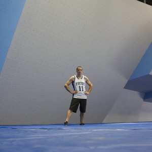
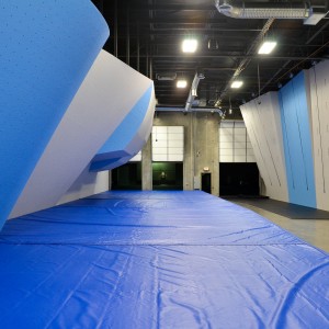
A: My favorite aspect of my design is the openness of the gym. There are no U-shaped coves or different canyons that segregate customers. I am able to see about 95% of the climbing terrain from my front desk. This makes it a very easy space to manage in terms of employees and safety.
Q: How would you seek to improve your climbing gym design?
A: Buy a bigger building.
Q: Why didn’t you include a freestanding boulder in your gym design like many gyms?
A: Freestanding boulders create blind spots that can only be seen by walking around them. They do not allow for good competition and it separates climbers from each other – it does not bring them together.
Q: What is it about your climbing wall design that expresses your own personal passion for climbing?
A: I love all types of climbing, but I have a special love for explosive/gymnastic movement. We were able to create a design that allows for gymnastic setting no matter where you are.
Q: How do you feel that your climbing gym reflects service-based design thinking philosophy?
A: I have been in the industry 20 years, and climbing has always been a social sport. Designing a gym that fosters social interaction creates more community between members and day-users. Gyms with separate canyons/areas, blind corners (free standing boulders), and an abundance of top-ropes limit the amount of interaction between the climbers. It’s time for new gyms to elevate the standard and make a better product – not the same product in a shiny wrapper.
Q: How do you view your climbing wall design as an attribute to your brand?
A: In Phoenix (and many other cities), Focus is setting a new standard for bouldering gyms. Many details are thought out in an effort to create an environment that is unlike any other facility. Some things that set us apart from other PHX gyms:
Cleanliness
Free chalk
Good toilet paper
Complimentary hot coffee
Fast wifi
Rating tags at the top of the bouldering walls
Supreme flooring system
Electronic waiver system
Fast member check-in
Q: Which climbing wall supplier built your walls?
A: Leading Edge Climbing Walls
Q: What were the selection criteria for the climbing wall company that you ultimately contracted?
A: The ability to take an independent design and make it, and sticking to their quote. Many wall companies want to design a gym that gives them the biggest profit. They don’t care about intersecting fall zones or traffic flow. Leading Edge took our design, built and completed it without a single change order (even when we changed the design mid construction).
Q: What were the most significance things that you learned during the process of designing your climbing gym?
A: I don’t know as much as I thought I did about design. Putting my trust in those who do was one of the best things.
Q: Please share any notable customer feedback that you have received regarding your climbing gym design.
A: “Your gym is bad ass, what else do you want me to say?” – anonymous customer. “I love the open layout, and color of the gym. Bright colors are so much better than earth tone drab.” – anonymous customer.
Q: From a design perspective, which other commercial climbing gyms are your favorites and why?
A: Stone Summit in Atlanta. I think its laid out in a similar way as Focus. Inspiring design for sure.
Q: In your opinion, what are the most common design related mistakes historically made by commercial climbing facilities?
A: Being overbuilt – too much wall, not enough egress. Archways are horrible and make me cringe when I see them as it creates blind corners and intersecting fall zones.
Q: Any advice regarding the design process that you can offer aspiring climbing gym owners?
A: Don’t be too stubborn in your own ideas of what you envision for what Futurist can create. Build a gym for the future, not for how gyms have been built the previous 15 years.
Q: How important do you think it is for a modern era climbing gym owner-operator to be actively practicing the sport of climbing?
A: On a scale of 1-10, an 11.
Q: From an idealistic standpoint, what would be the ultimate super charged dream climbing gym design concept of the future?
A: Drop Focus inside Stone Summit – a facility big enough to have world cup lead and bouldering events.


