Facility: Crimper’s Climbing Gym, Blacksburg, VA
Futurist Services: Business Consulting, Wall & Facility Design, Custom Flooring System
Open Since: April 2012
Website: www.crimpersclimbing.com
Q: Why did you choose to engage Futurist Climbing Consultants as independent designers for your climbing gym?
A: Our decision to engage Futurist was based on a few long conversations with Timy Fairfield and the realization that his perspective on what makes a great climbing gym was similar to ours.
Q: What inspired your climbing gym design (other gyms, art, architecture, rock, etc.)?
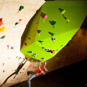
A: Our inspiration was always beauty in movement and simplicity in design. We wanted strong lines, like a ballet dancer and open terrain. We knew we were not trying to mimic outdoor climbing, or any existing climbing gym.
Q: Which of your own gym’s design attributes are your favorite and why?
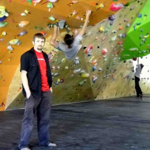
A: For me personally I love every part of our climbing area. The 357 wall (steep section left of the prow) is my favorite area to train, because it makes me feel very weak and part of training is failing.
Q: How would you seek to improve your climbing gym design?
A: Any improvement would be based in usability, flow and function. What could we add that would not detract from the positive function of our gym and the general feel and flow? The openness is what makes our gym so fun to train at.
Q: Why didn’t you include a freestanding boulder in your gym design like many gyms?
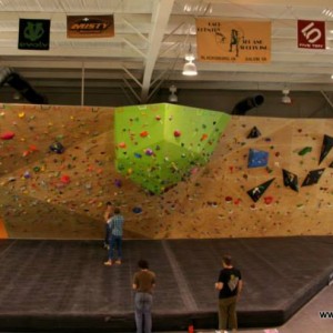
A: In a way this question answers itself. Our goal was to take the best parts of our experiences and combine them into one space. What other gyms do or do not do could never be the reason we would do something or not do something. We strive for a balance of our personal goals and tastes and creating a smart business. The space requirements for a freestanding boulder eats so much floor space that we would start to lose that openness that we strove for in the design.
Q: What is it about your climbing wall design that expresses your own personal passion for climbing?
A: Crimper’s is a climber’s gym, we will never sacrifice that core-climbing by watering down climbing for the masses. Crimper’s is not an amusement park. Crimper’s is a Gym for Climbers.
Q: How do you feel that your climbing gym reflects service-based design thinking philosophy?
A: The gym was designed very open, so a lot of people can climb and not feel too uncomfortable. There is also plenty of space for stretching, working out, or just hanging out. People feel comfortable when they are here.
Q: How do you view your climbing wall design as an attribute to your brand?
A: The product of Crimper’s is great routes, instruction, and training. The walls and their design create the space for this work. Our brand is how we carry ourselves and the design of the wall must match that.
Q: Which climbing wall supplier built your walls?
A: Our walls were built by Leading Edge Climbing Walls.
Q: What were the selection criteria for the climbing wall company that you ultimately contracted?
A: Our main criteria were quality of work and flexibility to accomplish our vision. It was important that they not just build what we want or just what they want. We wanted a builder with the climbing wall experience who was willing to go out of their comfort zone and try new designs and techniques, but also knew when something would not work.
Q: What were the most significance things that you learned during the process of designing your climbing gym?
A: Communication and trust are everything. It is easy to get so tied up in your vision, that you miss obvious problems. But you also need to keep your vision: it has to be a two way, frustrating and sometimes loud, street. Never go to bed angry.
Q: Please share any notable customer feedback that you have received regarding your climbing gym design.
A: We have had a number of people tell us that our ideas were not good and that we should do what every other gym does. Then they climbed here, and stopped saying that.
Q: From a design perspective, which other commercial climbing gyms are your favorites and why?
A: Focus Climbing Center looks outstanding to me; big wide features, open space, light-filled. Classics like Vertical Hold in San Diego and Boulder Rock Club in Boulder show that quality route setting can make any space fun and good training.
Q: In your opinion, what are the most common design-related mistakes historically made by commercial climbing facilities?
A: Closed in dark spaces with arches. I do believe that it is a mistake to start design with the walls, you should always start with the flow, restrooms, and egress. Always think of the actual walls as the blank pallet, not the product.
Q: Any advice regarding the design process that you can offer aspiring climbing gym owners?
A: Have your vision and your philosophy and stick to it; but always listen to experience. The wall design might be the most fun part, but be sure that the rest of your business is ready to go.
Q: How important do you think it is for a modern era climbing gym owner-operator to be actively practicing the sport of climbing?
A: I do not know why someone who was not absolutely consumed by a passion for climbing would want to run a climbing gym. Gyms are lots and lots of work, and you have to want to do it. But at the same time, when you are operating a climbing gym, you are not a full time climber.
Q: From an idealistic standpoint, what would be the ultimate super charged dream climbing gym design concept of the future?
A: Large, light and open, some ability to divide customers, but also bring them together. Air handling that is quiet, and keeps it warm in the winter and cool in the summer, but not too much.


